
Blogs

Introduction
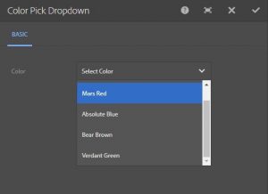
Most organizations use a set of brand colours on their website. A dropdown colour picker for AEM helps implement this by restricting the colour choices available to authors. However, once this list of colours increases and goes beyond a particular number, it becomes difficult to keep track of exactly which colour each name refers to.
Requirement
Find a quicker and simpler way to select colours so that authors don’t have to rely on trial-and-error.
Analysis
A full colour picker would help the author preview the colour they are about to choose but would fail to restrict them to the set of brand colours. It would be ideal to have the best of both worlds: the choice-restriction of a dropdown, and the preview capability of a colour picker.
Proposed Solution
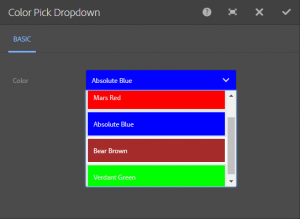
A dropdown with each option has the respective colour as background (fig. 2). This fulfils both the requirements and has the best of both worlds.
Discovery
Component dialogs’ behaviour and styling is handled by the ‘cq.authoring.dialog’ clientlib by default. This makes it quite easy to modify default dialog behaviour, since all that’s needed is to create a clientlib with ‘cq.authoring.dialog’ category.
Implementation
NOTE: The following has been implemented and tested in AEM 6.2
To add background colours to each option in the dropdown, store the hex value of the colour as the value of each option in the dropdown, and finally set the background through JS.
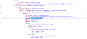
- Add a class “colorfulDropdown” to the select field in the component dialog:

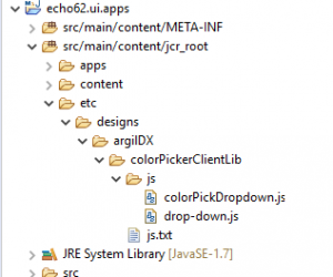
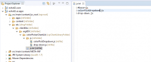
Fig. 3: Adding the class “colorfulDropdown” to the selected field. - Create a clientlib like so: “/etc/designs/argilDX/colorPickerClientLib” and add a category with value “cq.authoring.dialog” :
Fig. 4: Create a clientlib and add a category with value. - Create a file called “js.txt” under your new clientlib and add the following lines:
#base=js
drop-down.
jscolorPickDropdown.js
4. The following files should be placed under the clientlib folder in the “js” folder
drop-down.js
//To set the color of the select button on dialog load
$(document).on("foundation-contentloaded", function(e) {
    bgColorSelect.colorfulSelector();
});

//To change the color of the select button on option select
$(document).on ("click", ".colorfulDropdown ul", function(e) {
    bgColorSelect.colorfulSelector();
});
colorPickDropdown.js
let bgColorSelect = {
       colorfulSelector : function() {
    	//The dropdown itself
        let dropdown = $('.colorfulDropdown ul');
        //The select button for opening the dropdown
        let selectButton = $('.colorfulDropdown button');
        //The list of options
        let optionList = dropdown.children();
        if (optionList.length > 0) {
          for (let i = 0; i < optionList.length; i++) {
           //The color's hex valuestored as an option
           let optionValue = optionList[i].getAttribute("data-value");
           if (optionValue) {
             //Set the background of the option
             $(optionList[i]).css("background-color", optionValue);
             //Make the border white
             $(optionList[i]).css("border-style", "solid");
             //Make the select button the same color as the selected option,
even when the dialog has just been loaded
             if($(optionList[i]).hasClass("is-highlighted") ||
$(optionList[i]).attr("aria-selected")==="true"){
              $(selectButton).css("background-color", optionValue);
            }
          }
          else {
            //If the option has no value, make the background transparent
            $(selectButton).css("background-color", "transparent");
          }
        }
      }
    }
};
How to Use:
- Download the package here
- Open ‘/crx/packmgr’
- Upload and install the package. Make sure ‘Force Upload’ is checked
- Drop the Color Pick Dropdown component (in Home group) on to any page and open the dialog
- You can see the dropdown colour picker for AEM in action
If you’re interested in other OOTB solutions customized to make your life easier while working on AEM, drop us a message.

July 31, 2019


I need to add this to a multifield. But the issue is, when I change the color in the bottommost dropdown, it changes in the above dropdowns as well. Can you please help?
Hi Vaibhav
Can you tell us the AEM version you are trying to implement this on? Also what type of multifield are you using?
This would help us figure out the issue better and assist you further.
Thank you!
I’m running AEM 6.5
The dropdown items don’t have related color.
Hi Jack
Thank you for your question.
As your dialog has multiple colorpicker dropdown, the css classes, which are being used for color, are conflicting. If you change the class ‘colorfulDropdown’ of one of the dropdown to something else and do the necessary additional changes in the respective js file, then your issue would be resolved. We hope this helps!
Please feel free to write back to us if you face any further challenge.
I need to make it a gradient with 3 colors any idea?
Hi Annie
Thanks for the question.
We found a similar question and a corresponding detailed answer on Adobe Help Center that relates to your query.
Follow this link https://helpx.adobe.com/experience-manager/using/custom_touch_resourcetype64.html